Design Tokens
Better style management for the BuzzFeed app


Overview
The visual styles in our app were so confusing that designers, Android and iOS engineers had their own understanding and implementations. We needed an approach that doesn't just solve our problems today, but also sets us up for the future.
So I proposed we adopt design tokens into our workflow. Doing so helped dramatically improve our understanding of styles while also being easy to maintain.
Problems
With every feature our team shipped, visual cohesion increasingly suffered.
- Android and iOS apps had visual inconsistencies
- Many points of erosion - iOS & Android, light & dark theme made 4 variants to consider when designing
- Styleguides fell out of sync as the product evolves
- Unsure how reliable the codebase or design styleguides were
We needed an approach that doesn't just solve our problems today, but also sets us up for the future.
Goals
We aimed to
- Achieve and maintain consistency in the app
- Ensure visual design across both Android & iOS apps feel cohesive
Approach
Design Tokens
Design tokens are simple key-pair values that store visual information. They're a low-cost way of managing styles.
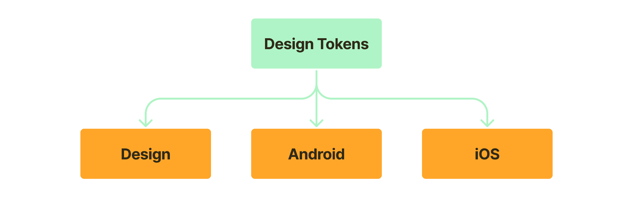
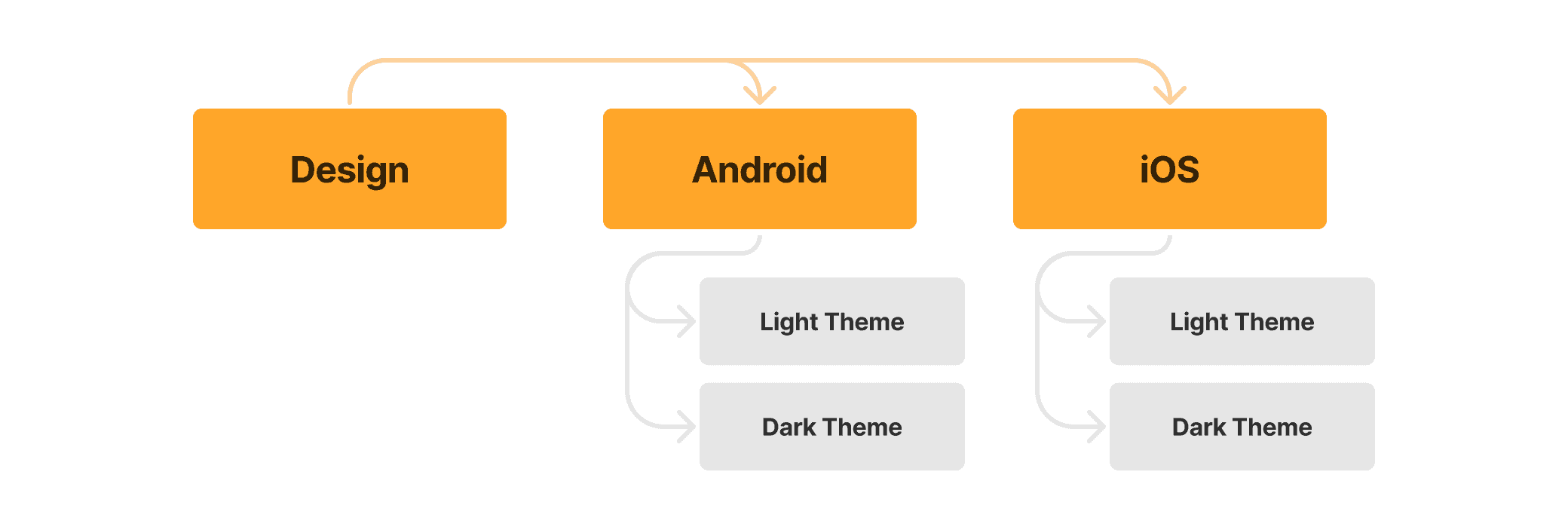
Using design tokens moved us towards having a single source of truth. It simplified managing and applying visual decisions across Design, Android, and iOS.
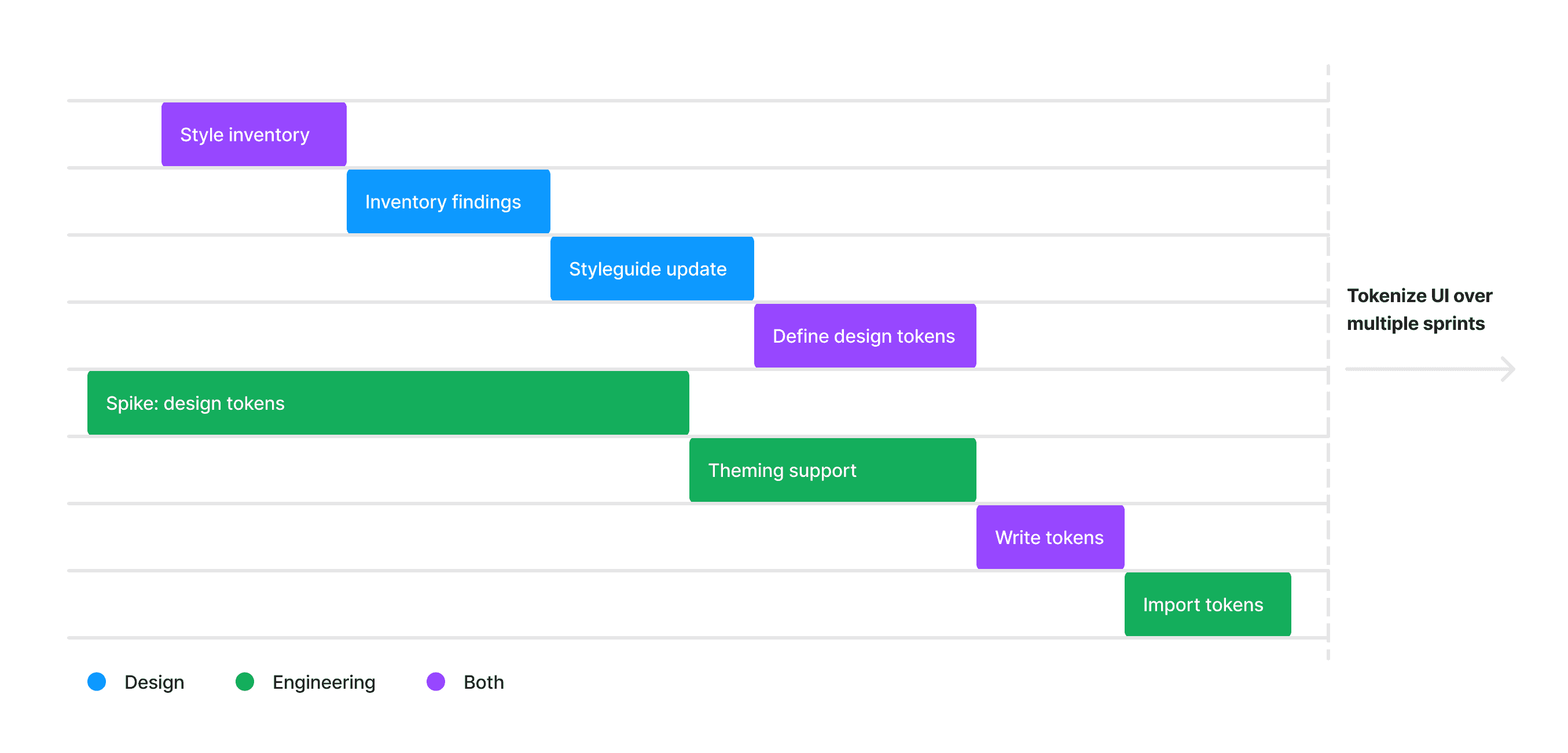
But before that, we first needed to understand our current styles and how they're being used. We did that by taking an inventory.
Style Inventory
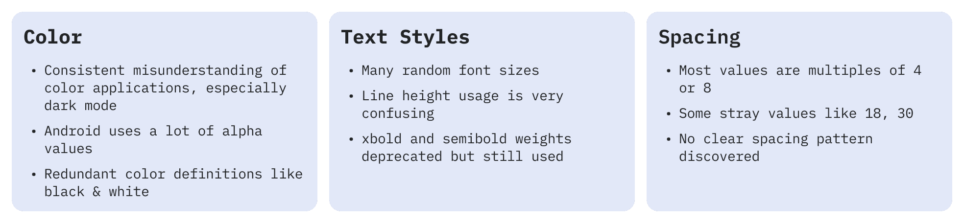
Styling defined in code dictates the app's visuals. So I sat engineers to take an inventory of our styles.
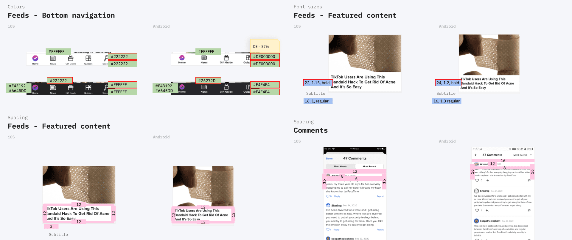
The inventory was performed screen by screen, focusing on colors, fonts, and spacing to understand how we currently use our styles. These findings were then presented to the team.
Once we knew where to focus on, I started documenting how we currently use our styles along with a proposal to make necessary updates.
Styleguide update
To ensure these proposals work, they were used to mock key screens. They were validated with feedback from the App team and the larger Product Design team.
Luckily, most of the recommendations weren't 'new'. For example, we already had a good set of colors that worked. It just wasn’t always clear where to use what. This phase helped clarify that.
However, creating an updated styleguide wasn't the end goal. We needed our engineering friends to be in sync with these design decisions as well. That's were design tokens came in.
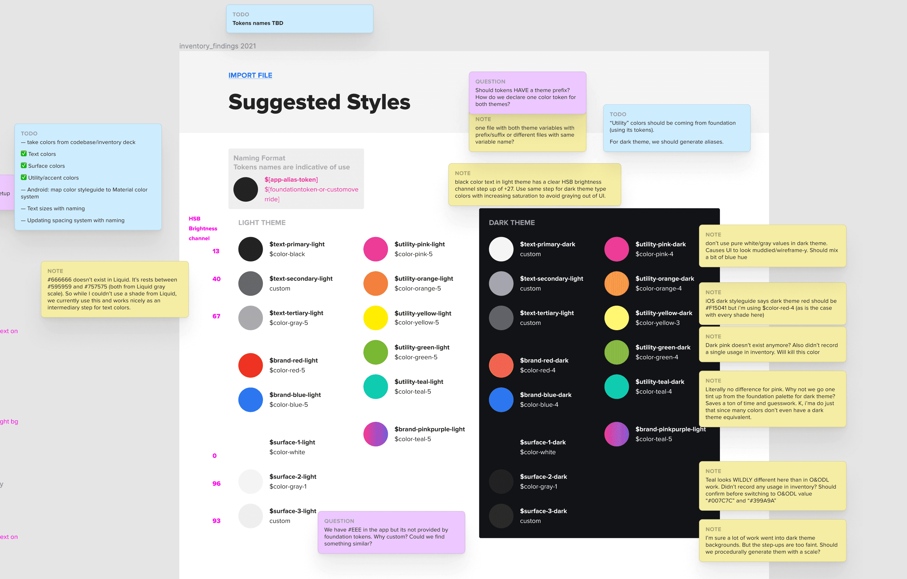
Defining Design Tokens
We wanted tokens to communicate it's intended use. To do this, I proposed naming them semantically. Here's an example.
// BEFORE - short, literal, but ambiguous
$red: #EE3322

//AFTER - descriptive, but clear in intended use
$color-brand-red: #EE3322
By working with engineers, we were able to clearly name and categorize tokens in unison. The end result was a singular set of styles that were defined similarly across Figma, Android and iOS.
Implementation
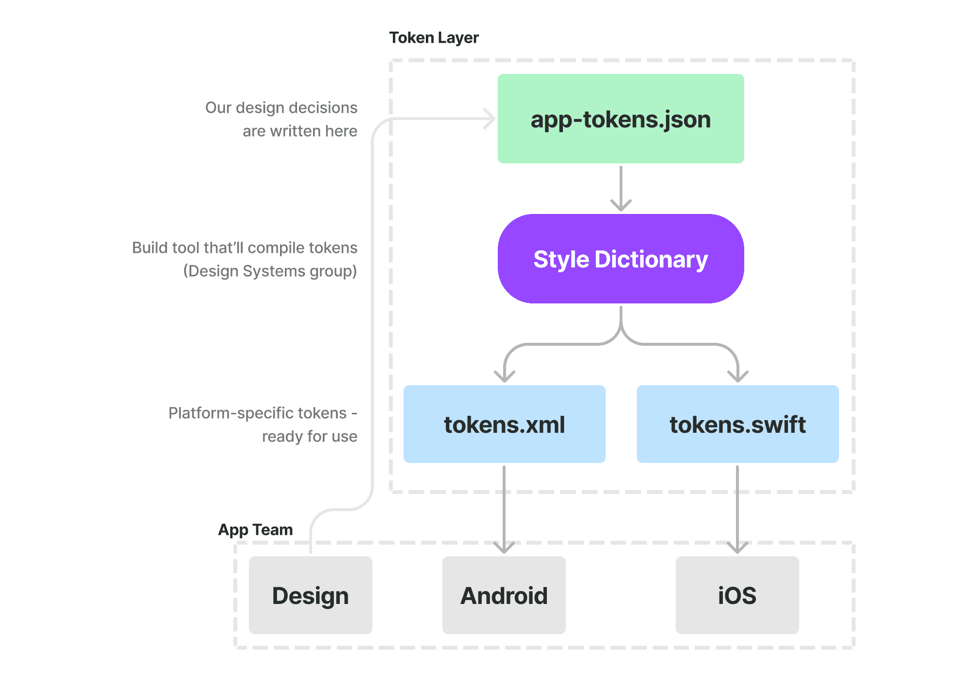
We stored our design tokens in a central location on GitHub. It allowed both designers and engineers to access and contribute to it.
Tokens for designers – Figma UI kit
I built a Figma UI kit with styles representing our design tokens so other could easily use them when designing.
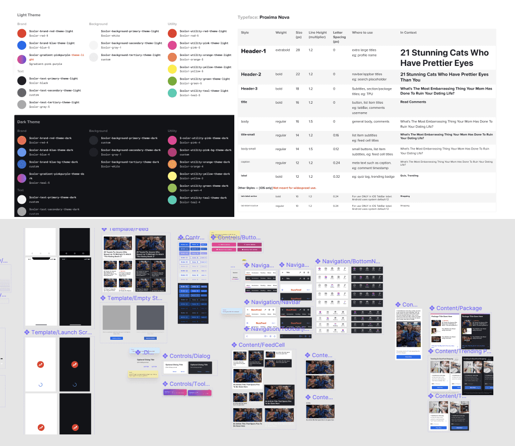
It also provided other benefits:
- Improving understanding of our styleguide and how it's applied across core UI elements
- Helped unify visual language across Android & iOS where applicable
- Give engineers clarity when inspecting designs (Figma styles and design tokens share the same name)
Outcome
Over multiple sprints, we applied design tokens across the entire app.
- Tokens improved our understanding of styles, bringing design & engineering closer
- Design, Android, and iOS communicated via a shared language understood by all
- Developer handoff had more clarity, improved our confidence and reduced design QA time

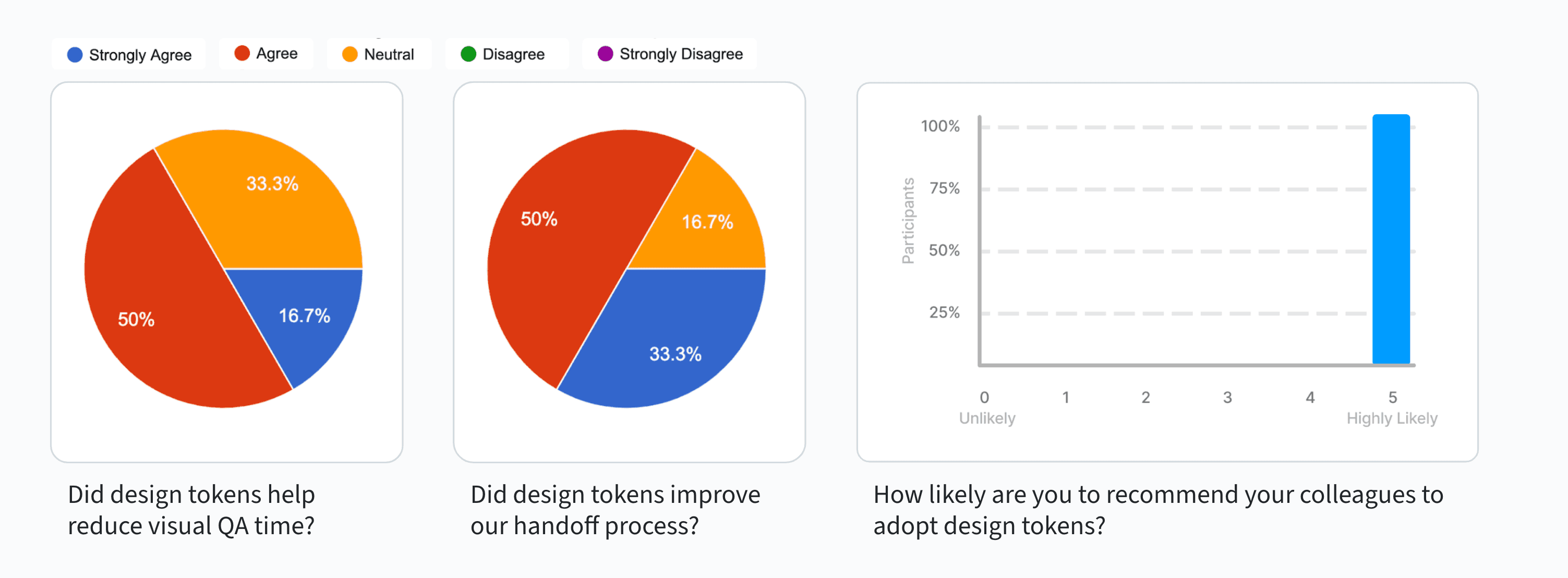
Feedback from the team
Once we were used to this new process, I ran a survey to see how the team felt.
"Design Tokens work because of a clear, well-organized source of truth. We refactored a lot of code using tokens everywhere. You can see the difference in our files - more clean, easy to read, which is reflected in our UI." — App engineer
Learnings
- Getting the team on the same page early on and being transparent helped speed things up
- A shared vocabulary has helped the team better understand our styles
- Documentation helped grow our tokens and enabled contributors