BuzzFeed+
A subscription offering for app exclusive features
Overview
BuzzFeed+ is an enhanced experience launched for iOS users for a monthly subscription. I worked with the Apps team to define strategy and design the product.
Why?
- User frustration with excessive ads (app reviews and diary study)
- Declining ad revenue (pandemic impact)
- Opportunity to address both user and business issues
Timeline: 4 weeks (Apr - May 2020)
Goal
To create an improved, app-exclusive experience that users would find valuable enough to pay for.
Risks & Constraints
- A custom payment solution would be complicated so we used Apple Pay which handles most of the payment experience
- Asking people to spend more at a time of worldwide economic difficulties
Design approach
The team and I first defined the product offering. Then, looked at subscriptions across similar apps to understand what the baseline experience should be. The design phase involved multiple iterations of exploring and refining. Iterations were informed by feedback from the team, cross-product designers and legal.
Definition & Strategy
From a product perspective, we wanted to answer:
- Is the ad-free experience alone valuable enough to pay for?
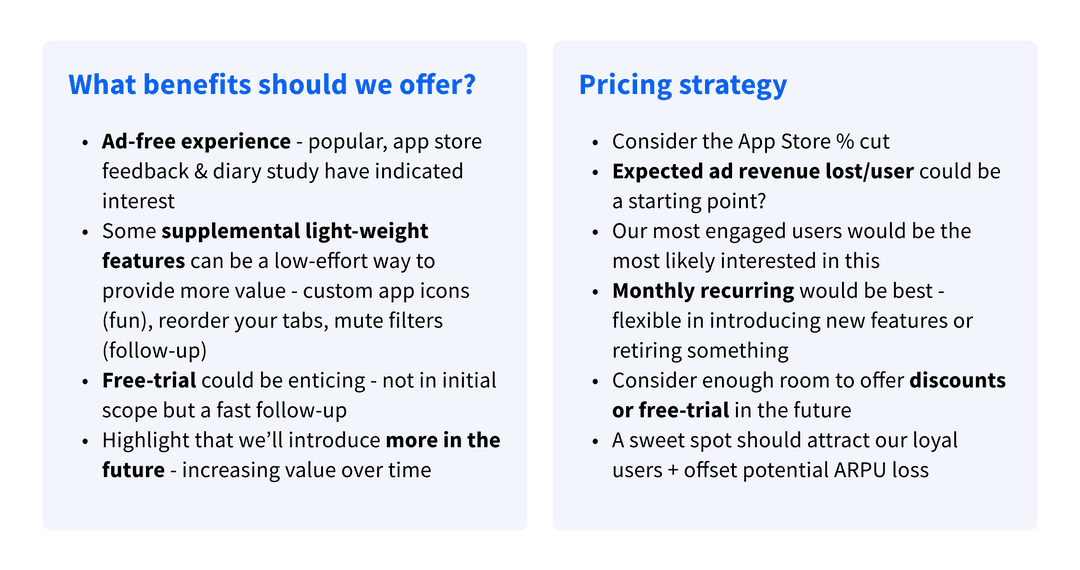
- What else could we do to increase the value of our offering?
- How much would the subscription cost and how do we determine that?
Along with ad-free, we chose to add other feasible offerings that would feel BuzzFeed-y and also offer utility. This would avoid feeling transactional - "pay X dollars to remove ads" and enable us to provide users more value over time.
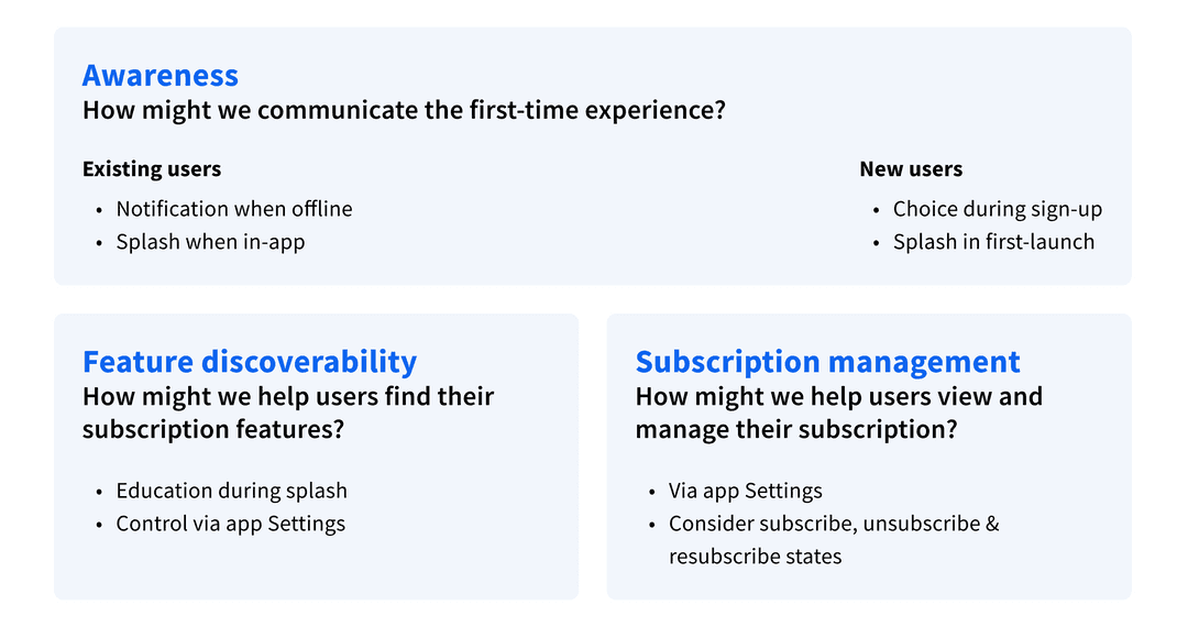
For design, we thought about how might we:
- Create awareness for this feature?
- Make it easy to control subscription features?
- Help users find and manage their subscription?
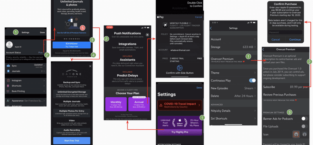
Competitive Audit
To better answer these questions, and understand subscription experiences, I looked at the subscription experience across six similar iOS apps.
Here are some common themes and takeaways.
Explore
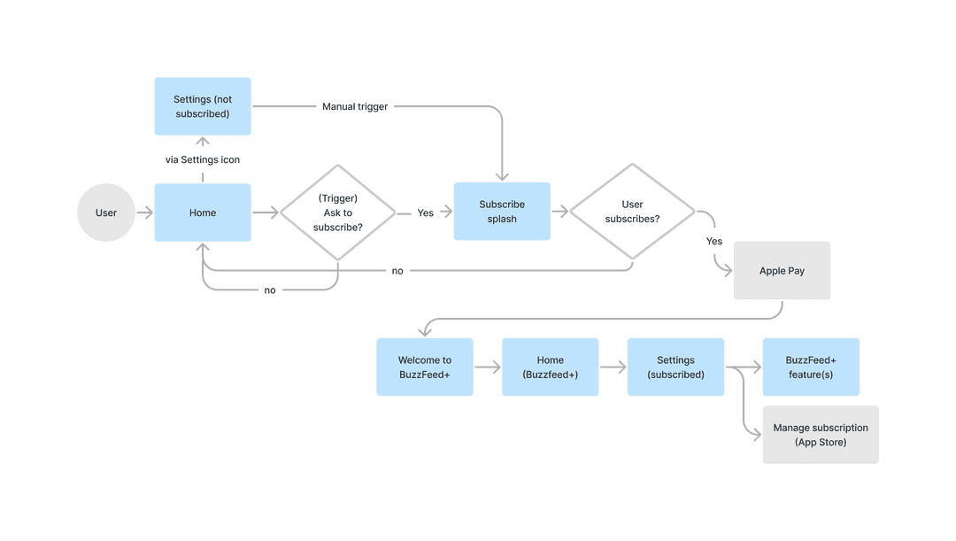
With the product defined, questions answered, and a better understanding of subscriptions, I put together a flow to demonstrate what our offering could behave like. Then, by focusing on key areas, I aimed to quickly generate multiple design concepts.
User flow
Defining the user flow helped everyone visualize what the experience would look like and reveal scenarios to consider early on.
We decided to
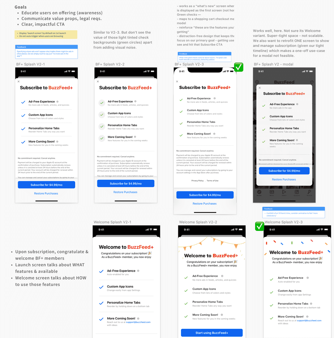
- Show a one-time 'splash' to educate users on the new offering
- Prominently display the offering in settings (should users change their mind)
- enable users to control subscription features from settings
The user flow revealed key areas that required the most focus. They included the subscription splash (before & after states) and management.
Design explorations
I explored various concepts, trying to refine layout, copy, and visual design at each iteration.
Subscription splash
Communicating benefits
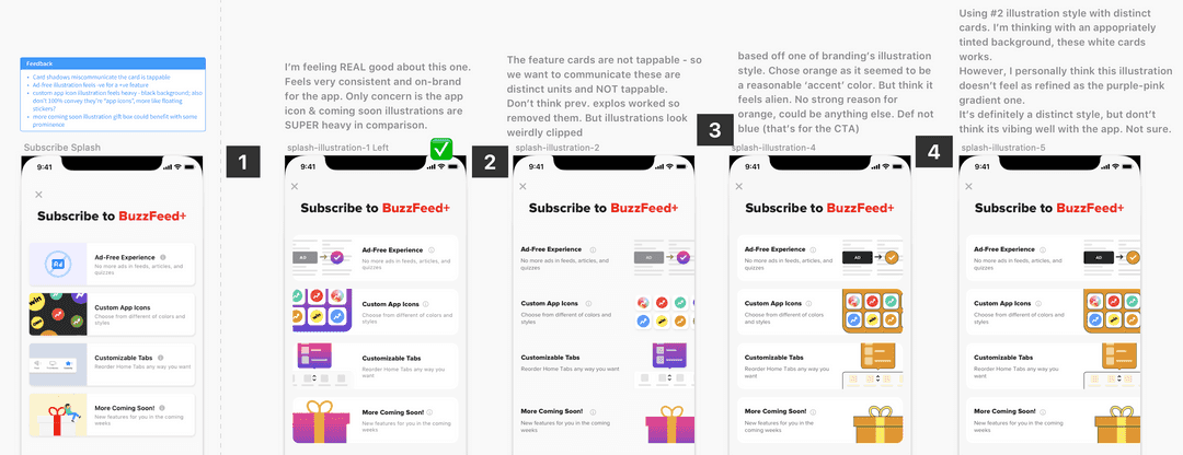
One concern was that the copy on its own was not successful in communicating the features. I agreed, and believed that somehow 'showing' users would be more effective. So I explored ways to do that with more visuals and fewer words.
After a wide range of explorations and feedback from stakeholders, I had a strong sense of direction.
Refine
This phase focused on tightening copy and final visual design tweaks.
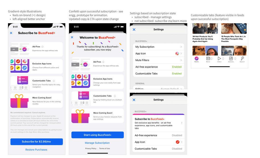
- Gradient is a familiar pattern used decoratively across the app and site
- Cards help contain each feature and not including a shadow avoids feeling like a tap target
- Collaborated with engineering to create confetti animation that celebrates subscription
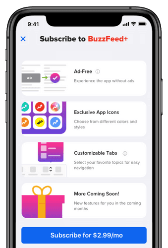
High-fidelity prototype
Outcome
After launch, we noticed only 0.1% of users who saw the subscription splash made a purchase. We introduced a 7-day free trial and saw a significant improvement, with 74% of users subscribing. Over successive weeks, 85% of users retained their subscription, suggesting that those who tried the experience found it valuable enough to continue.

